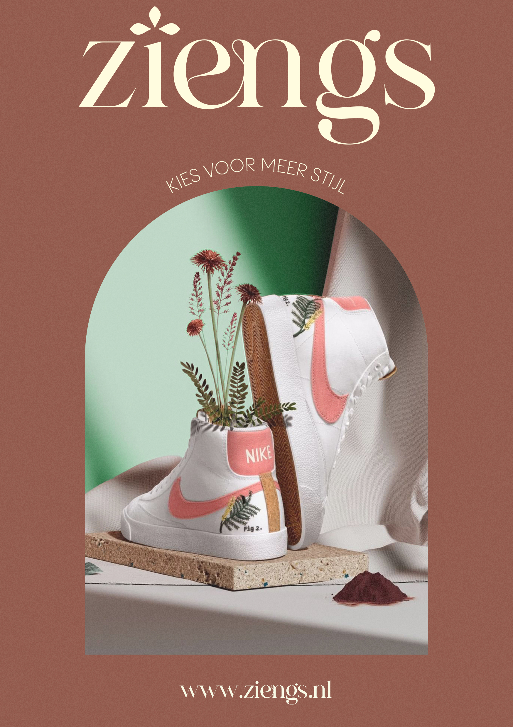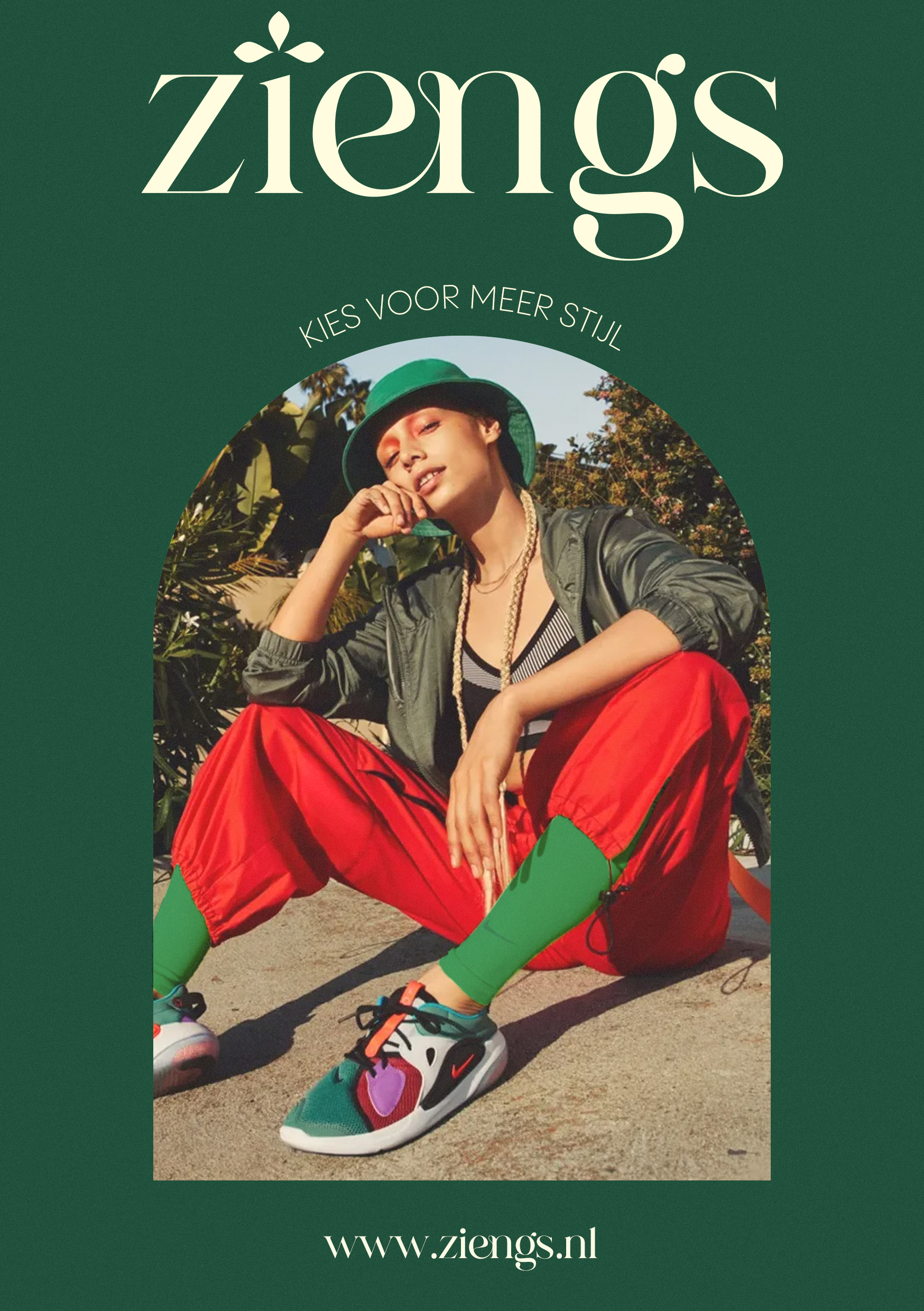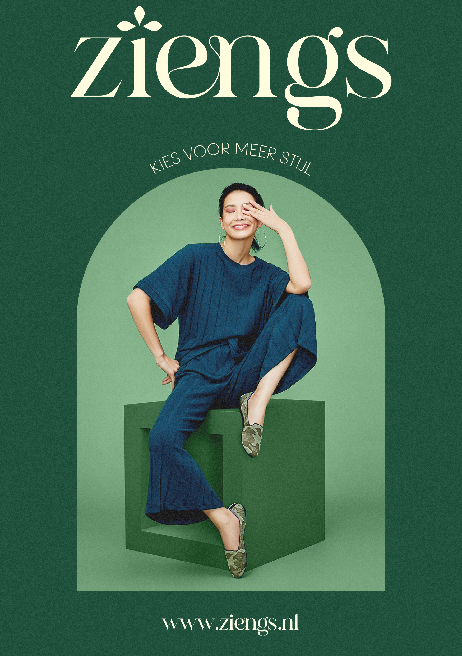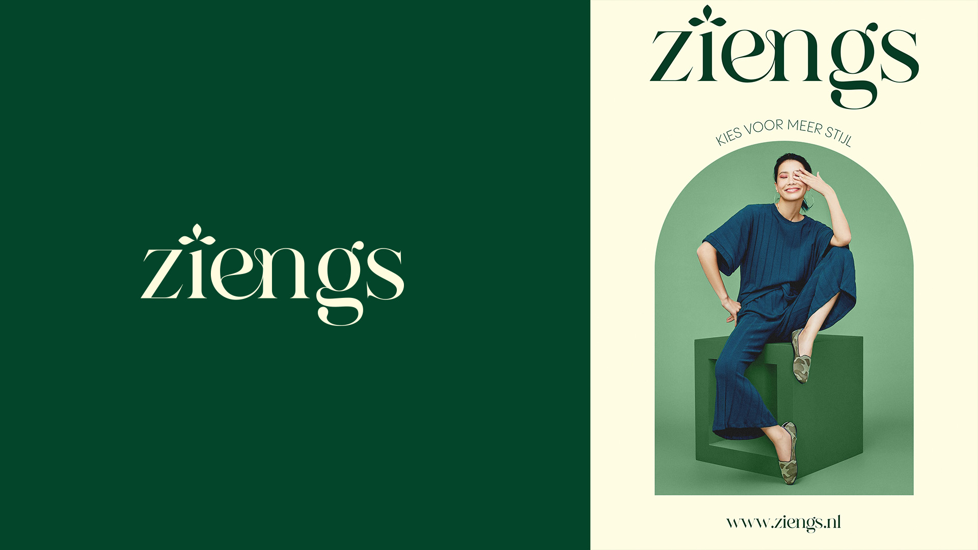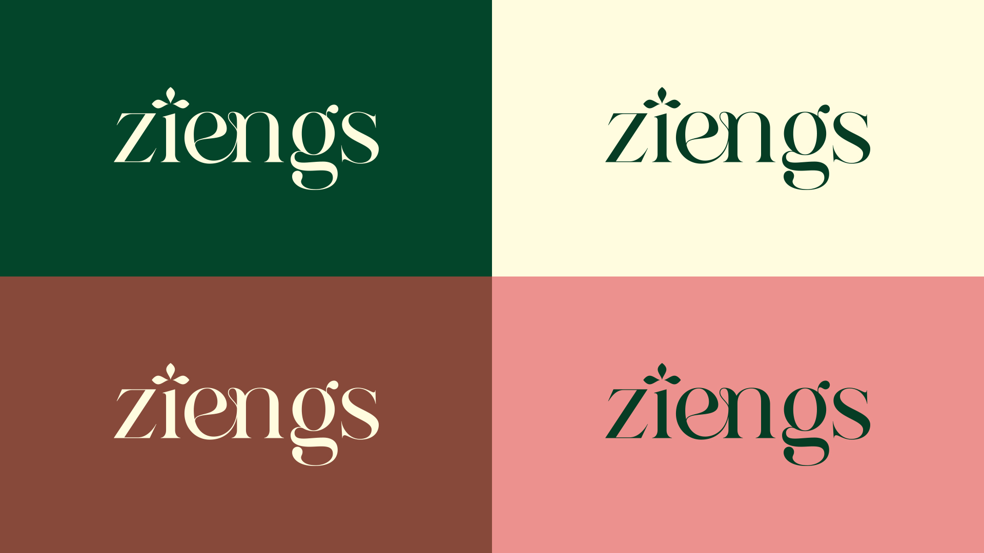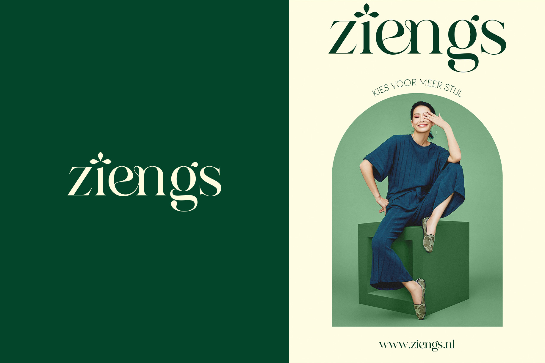
One of the propositions that were made for the rebranding of Ziengs. Their demographic target is mostly constituted of women, so we chose a design that would be elegant, with a serif font that feels classic, but with a bit of personality thanks to the arabesque that serves as a ligature between the e and the n. The color palette is based on earth tones to convey authenticity.
The crown is an important element of the brand, and they absolutely wanted to keep it. But their current crown design is far too “rigid” and angular and would create a clash. So I revamped it, but chose a Tiara as the base shape. It’s a better match for their demographic, and it’s floral aspect ties in nicely with the curves of the font.