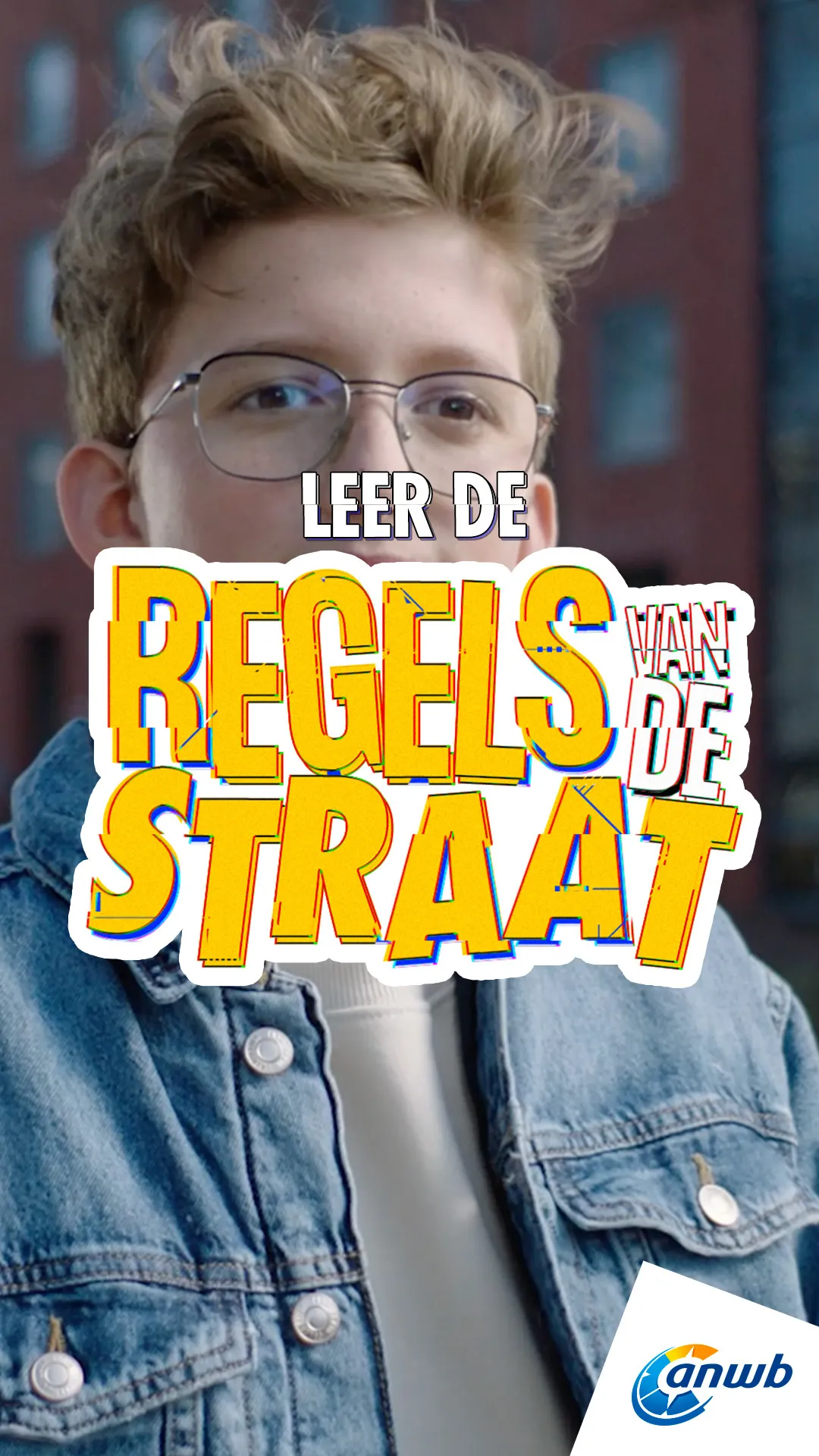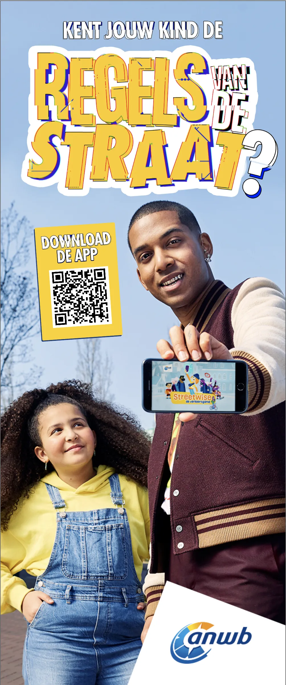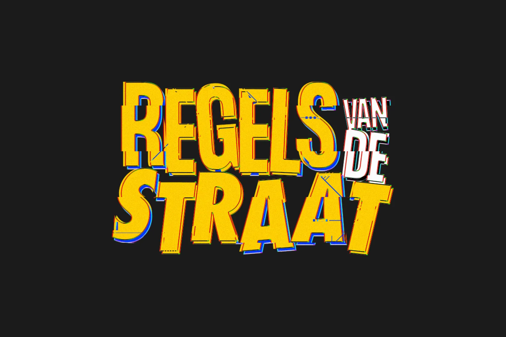
As part of their promotional campaign for the game Streetwise, I was tasked with the realization of a logotype that would be used across various supports. The logo needed to be reminiscent of the street culture, but without falling into the old-school cliché of graffiti. It needed to feel modern.
I went for something that felt digital, with the glitch cuts, the chromatic aberration, and the irregularities in the placement and orientation of the letters adding a bit of dynamism.